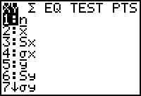
Option 5 is the Statistics option,
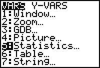
so press 5
 and get
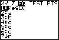
 Since choice 1 is highlighted and that is our option, press ENTER
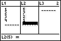
 is in L1 and L2 so we will use Plot1. Use the UP arrow key to highlight it and press
ENTER.
is in L1 and L2 so we will use Plot1. Use the UP arrow key to highlight it and press
ENTER. 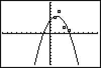
Before proceeding, be sure you understand how to find a
regression equation using the calculator.go to regression formulas
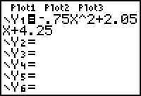
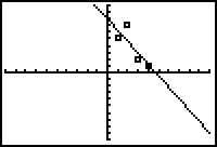
Once you have a regression equation from a set of data, it is good to see the
graphs. Starting with the data previously shown in the regression formula
demonstration, we can plot both the data and the equation.
and get
is in L1 and L2 so we will use Plot1. Use the UP arrow key to highlight it and press
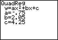
ENTER. How good a fit is it? Not great. Could we do better with a different regression formula? Here are some other results:
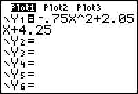
Cubic regression: 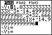
Linear regression 
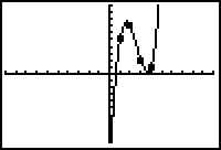
Both are better than the quadratic, but the cubic is the best of the three.